
Drumroll! 3, 2, 1….and here’s yet another room reveal. This time around I find that I am sharing something a bit more personal as it’s the MASTER BEDROOM. I am so pleased and excited about the result so far and hope you will love it too the way I do.
Just a quick reminder of how it used to look like: Talking about neon green galore with that horrible patterned carpet to a more tasteful “Denim Drift Blue” and creams.


And here’s the result so far….
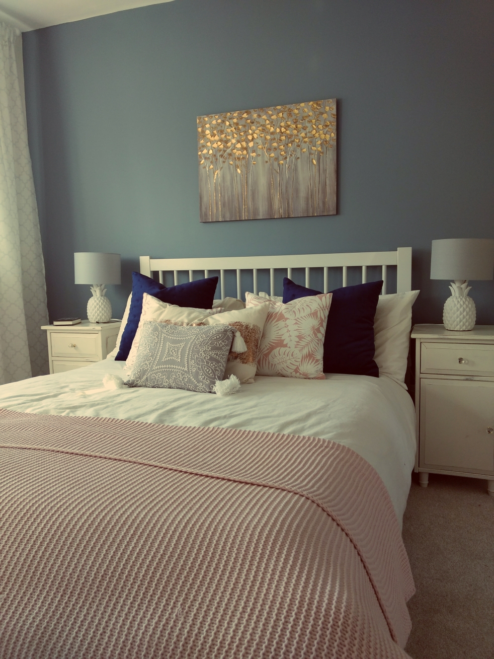
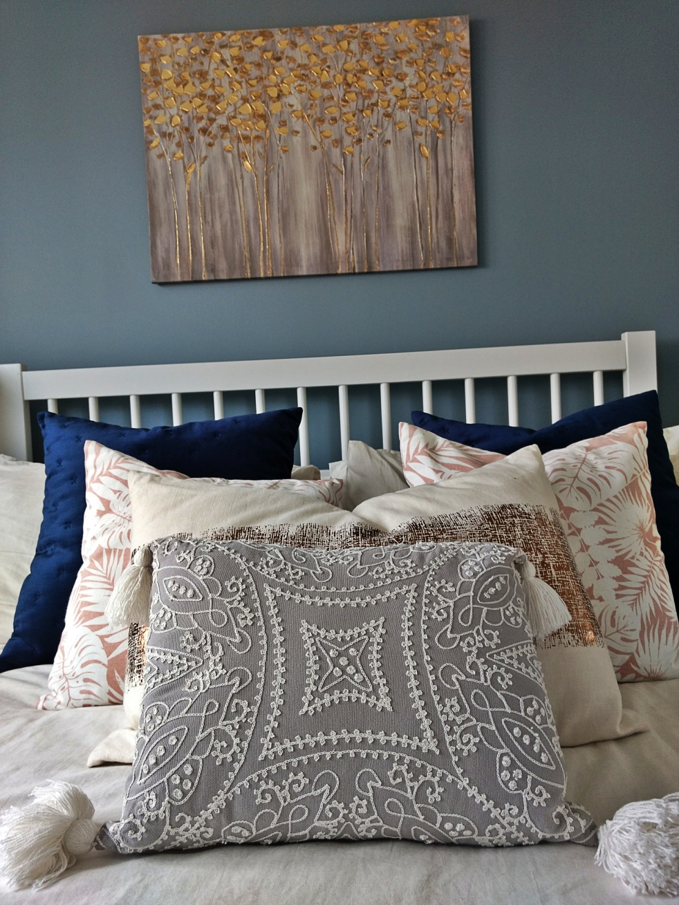
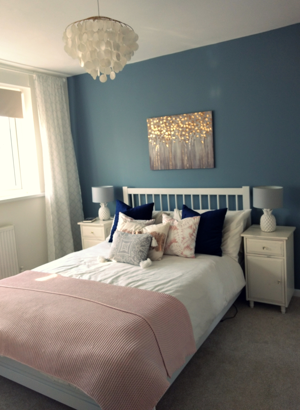
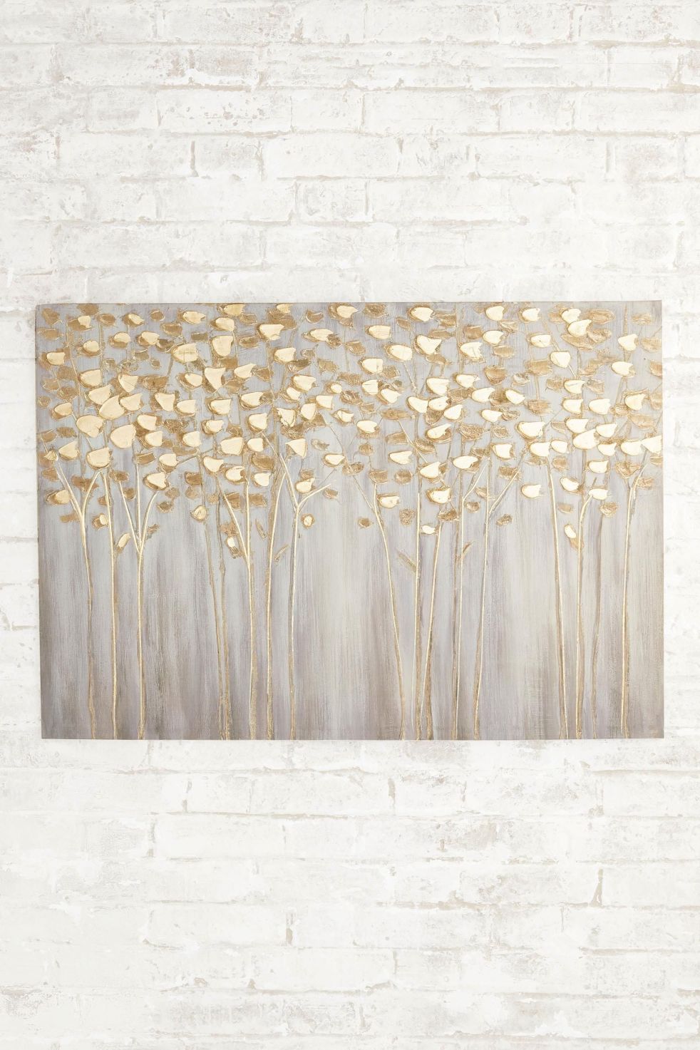
As mentioned before in one of my previous blog post I have been using the colour palette below as my guideline. I also pulled some colour inspiration from the “Gold Birch Trees” painting hanging above the bed which I used for the throw pillows and other brass accessories.


Top tip: If you are a bit overwhelmed with finding the right colour combination for a room you want to restyle, just pull colours from a picture or painting you would want to incorporate into the room and I can assure you that it is a no-fail solution to your colour scheme dilemma. 🙂
On both sides of the “Gold Birch Trees” painting, as I find currently it looks quite lonely on it’s own, I am planning to hang black and white pictures of my family in A4 format 2 sets on each side to give the room a more personal touch. I just haven’t come around to choosing the right pictures yet (plus I am waiting for baby girl’s arrival so I can add her picture to the set)
The IKEA Brimnes wardrobe hack:
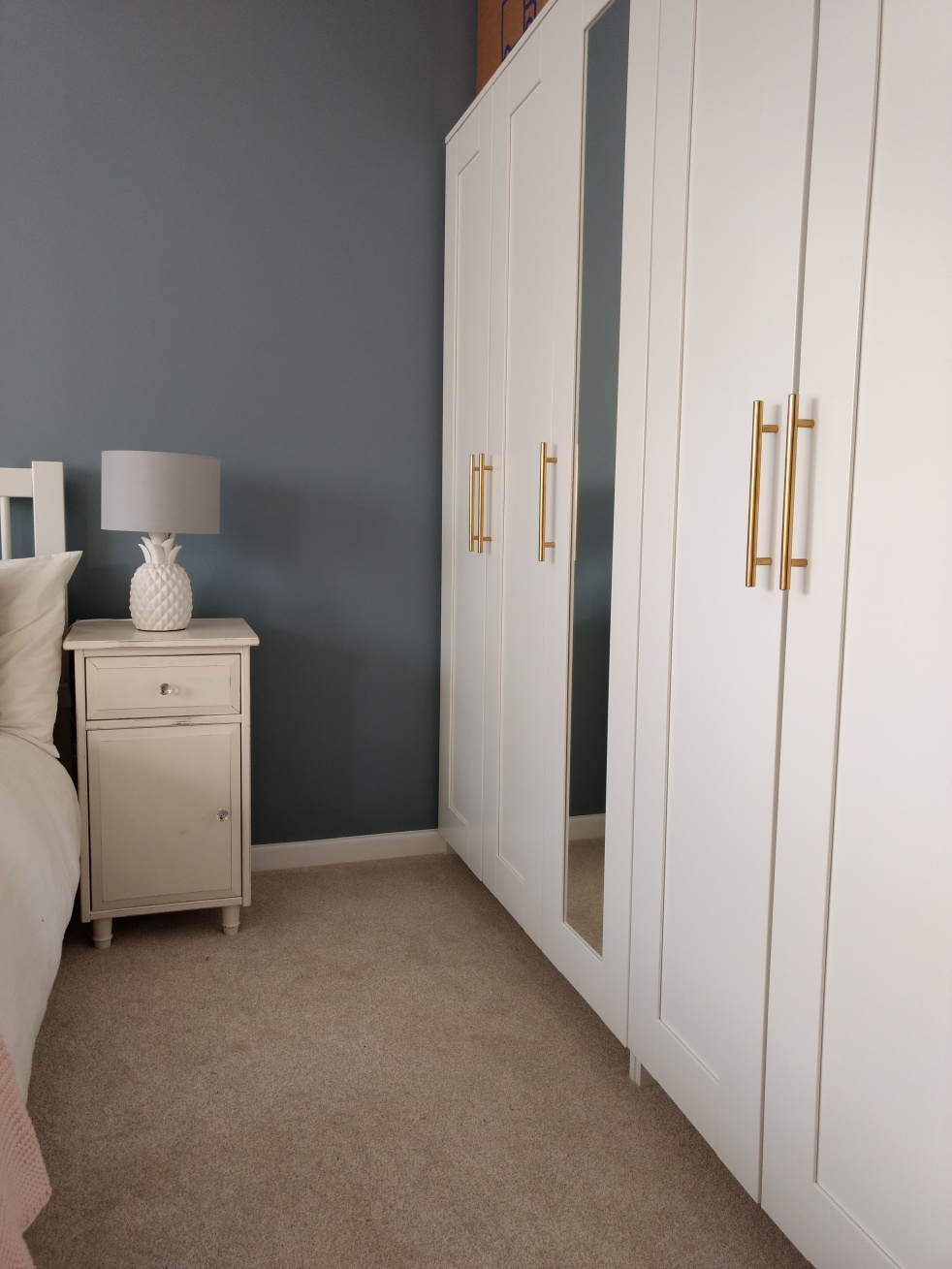
The Master bedroom is not a massive bedroom so Christopher and I had to be clever with where we place our wardrobe and storage within the room. And also the last thing I want to happen is for the room to feel smaller and crowded. At first, Chris and I were thinking of buying the PAX wardrobe system from IKEA, but then we soon realised that those wardrobes are just too deep and wide and it would’ve just drowned the room. So we decided to opt for the much more compact BRIMNES wardrobe in white. It’s the same one as in Joseph’s bedroom:
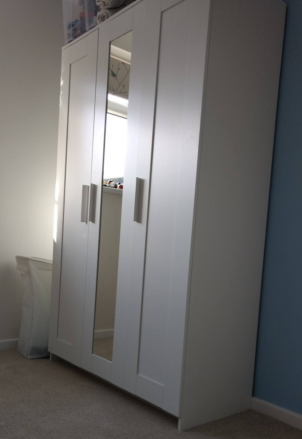
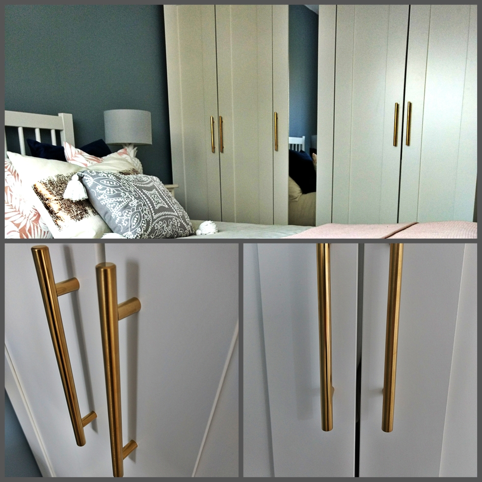
We bought a 3-door with a mirror and a 2-door and placed them side by side on the right side of the room. I like the wardrobe, although not my first choice they definitely do the job and they’re pretty neutral. However, for my own personal space it disturbed me how they were just kind of “plainish” and boring. One evening whilst browsing through Pinterest I came across a picture of kitchen cupboards with chrome t-bar handles on them. It’s when I had one of those EUREKA moments of changing those “plainish” white handles of the wardrobe into gold/brass effect t-bar ones! And once I did it, it made all the difference. The wardrobes look more glam and pulled together and I also now feel they tie in nicely with the theme of the room! Woaho!
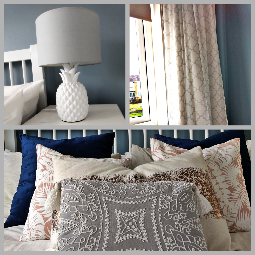
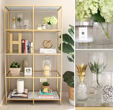
Here are pictures of other accessories I used in the room:
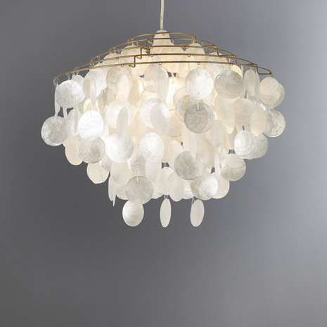
Isn’t this “Brass Capiz Shell” chandelier just gorgeous!? 😋 For those who would like to know, I got it from Dunelm during their last end of season sale!
I also love the pineapple shaped side table lamps and the lightweight, breezy curtains with it’s subtle grey trellis pattern which romantically frame our bedroom window.
So far this is how the master bedroom looks like. I am quite curious how in time it will change and grow with me a Chris. After all it’s his and my bedroom 😊.
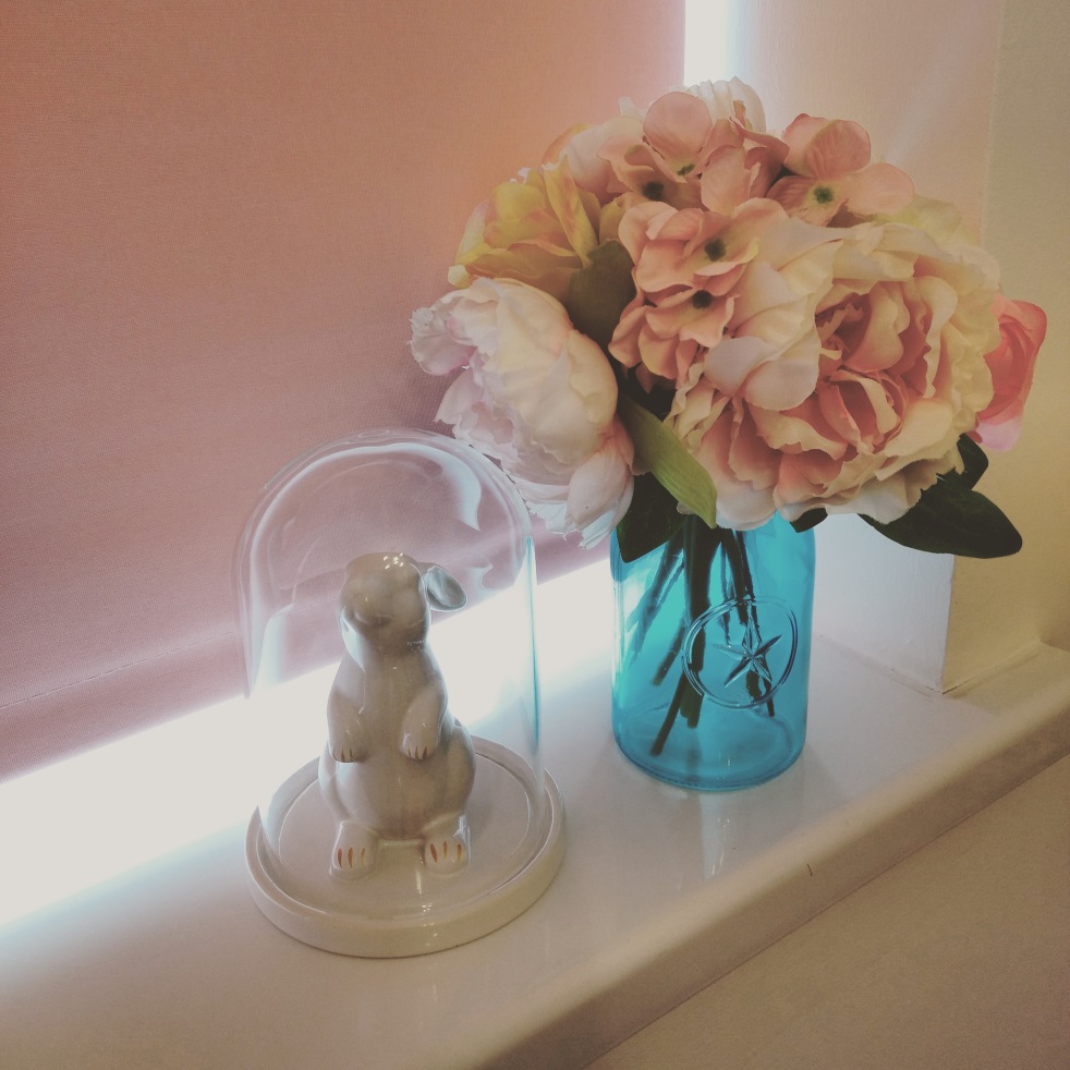
Stay tuned if you are curious how baby girl’s nursery will turn out. Think: blush pink, creams, rose gold, turquoise and peonies! Absolutely girly! 😋 Here’s a little taster:


 Ha! Do forgive me but I just can’t pose. Looking at these pictures makes me laugh!